Stop Rebuilding Loading, Success, and Error UI in Every iOS App
Configurable defaults, replaceable state views, and a shared presentation layer for SwiftUI and UIKit.

Add a spinner to a Save button, and the loading UI looks nearly finished. Then the operation needs a success message, an error with Retry, a way to close the result, and rules for what the user can tap while it is running.
A sign-in request and a document save do different work, but their feedback often follows the same sequence: loading, then a result, then dismissal or another attempt. Rebuilding that presentation in each feature spreads its behavior across the app. Reusing a fixed set of views becomes awkward when the next design needs a different indicator or error layout.
I wanted a common way to show those states, with defaults I could use immediately and state views I could replace individually. The feature should supply its result and decide what Retry does. The presentation should handle showing the chosen view, dismissing it, and controlling interaction with the content beneath it.
That is the scope of the HUD in this article: temporary loading and result views over the current app content. I will use a save operation to show the separation, then explain the implementation choices, including why I put the HUD in its own window.
Separate the operation, its state, and the views that display it
There are two kinds of reuse here. The behavior should stay consistent when several features use the same feedback flow. The appearance should remain replaceable when those features, or another app, need a different design.
I split the responsibilities at the points where they change for different reasons:
| Part | Responsibility |
|---|---|
| Application | Runs the work, handles cancellation and late results, and decides what Retry does |
| Presentation manager | Holds the current UI state and applies result-dismissal rules |
| View provider | Supplies the loading, success and error content |
| Presenter | Attaches the HUD and handles its display and input |
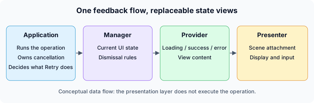
These are presentation responsibilities. The application’s operation runs outside this layer.
The manager can use the same success state whether its content is a checkmark and text or a view from the app’s design system. The presenter can keep its attachment while that content changes. Neither needs to know whether the result came from saving a file or signing in.
This also gives customization a practical order. Start with the default views. Change their settings for small design differences. Replace one state’s content when the layout needs more freedom, keeping the other defaults. Replacing an error view should not require another implementation of presentation and dismissal.
The app decides when work starts, supplies its result, and chooses what happens on Retry. The manager applies the result-dismissal policy. A presentation manager is not an operation queue or a task executor. In this design, one manager holds one current state; several simultaneous tasks need the app to decide which one that state represents.
The scope matters too. A modal HUD suits an operation that must keep the user in the current flow. If the rest of the screen should remain usable, an inline progress indicator is a different and often sufficient choice.
How I packaged this in DMUnLoader
DMUnLoader is the implementation I built around those responsibilities: a manager, a view provider and a scene-bound presenter. Its separate window handles placement and input; I will return to that mechanism after the state and customization examples. It supplies loading, success and error UI for SwiftUI and UIKit. The examples below use DMUnLoader 1.1.0, with iOS 17+ and Swift 6.2+.
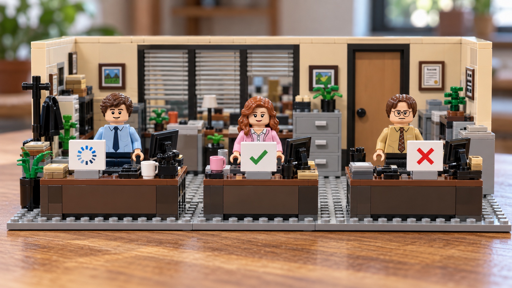
The loading manager exposes four operations:
| Call | What the default UI shows |
|---|---|
showLoading(provider:) |
A loading view until the app changes state |
showSuccess(_:provider:) |
A success view with the supplied result |
showFailure(_:provider:onRetry:) |
An error view with Close and, when provided, Retry |
hide() |
No HUD |
One manager holds one state at a time. The supplied success value conforms to DMLoadableTypeSuccess; String already does. The default success view uses that value’s description. The default error view uses the error’s localizedDescription along with the title and controls from its settings.
These calls present HUD content rather than navigate to another screen. While a state is shown, the HUD takes touches over the app content beneath its window in the same scene. Success and failure retain that modal behavior until dismissed. Placement relative to other windows depends on the configured window level.
Connect it once at the scene root
Add https://github.com/nikolay-dementiev/DMUnLoader in Xcode’s package dependencies and select 1.1.0 or a compatible release. This example connects a manager and provider at the scene root. The Save action owns the work and explicitly updates the HUD:
import DMUnLoader
import SwiftUI
import UIKit

@main
struct LoadingDemoApp: App {
    var body: some Scene {
        WindowGroup {
            DemoSceneRoot()
        }
    }
}

@MainActor
struct DemoSceneRoot: View {
    @StateObject private var manager = DMLoadingManagerMain(
        state: .none,
        settings: DMLoadingManagerDefaultSettings(
            hudWindowLevel: .normal + 1,
            backdrop: .dim()
        )
    )
    private let provider = DefaultDMLoadingViewProvider()

    var body: some View {
        DMRootLoadingView(manager: manager) { manager in
            Button("Save") {
                saveChanges(using: manager, provider: provider)
            }
        }
    }
}

@MainActor
private func saveChanges<
    Manager: DMLoadingManager,
    Provider: DMLoadingViewProvider
>(
    using manager: Manager,
    provider: Provider
) {
    manager.showLoading(provider: provider)
    Task {
        do {
            // Replace this delay with the operation you own.
            try await Task.sleep(for: .seconds(1))
            manager.showSuccess("Saved", provider: provider)
        } catch {
            let retry = DMButtonAction { [weak manager] in
                guard let manager else { return }
                saveChanges(using: manager, provider: provider)
            }
            manager.showFailure(error, provider: provider, onRetry: retry)
        }
    }
}
By default, the manager hides success and error after two seconds or on a tap, including failures that offer Retry. I will change that policy below so the failure can remain available until the user chooses an action.
The explicit window level places this HUD above normal-level app windows in its scene. The window section below explains the choice and its limits. The library defaults to .normal, so leaving the setting out does not make that same ordering promise.
The delay normally succeeds; replace it with the save operation whose errors you want to display. Retry calls saveChanges again, and that function explicitly switches back to loading. Its action captures the manager weakly because the manager retains the failure state and its Retry action. The presentation API runs on the main actor; the app still decides how to cancel work or discard a late result.
DMRootLoadingView(manager:content:) needs no app delegate supplied by the SDK. Keeping its @StateObject inside the scene root gives each root its own manager, which matters when the app has several windows. An app-level shared manager would share its state too.
There are also delegate-based integrations for SwiftUI and UIKit. UIKit requires a scene manifest, a configuration using DMSceneDelegateTypeUIKit<Helper>, and a helper that creates the root controller and receives its loading manager. After that setup, the UIKit screen uses the same state calls and providers. It can call saveChanges(using:provider:) with the manager supplied to it; this part of the feedback flow does not depend on a SwiftUI view body. The DMRootLoadingView(content:) initializer without an injected manager creates a manager and requires the SDK’s app/scene-delegate bridge; the injected initializer above does not. The README for 1.1.0 has complete examples for both frameworks. Use one integration per scene rather than installing the injected and delegate paths together.
Customize the defaults, or replace the state views
I do not need to write three new views just to change one icon. DefaultDMLoadingViewProvider accepts separate settings for loading, success and error. Each settings type exposes the properties used by its corresponding view: text, colors, images and layout.
For example, this provider keeps all three standard screens and makes the success icon mint:
import DMUnLoader
import SwiftUI

@MainActor
func makeMintProvider() -> DefaultDMLoadingViewProvider {
    DefaultDMLoadingViewProvider(
        successViewSettings: DMSuccessDefaultViewSettings(
            successImageProperties: SuccessImageProperties(
                foregroundColor: .mint
            )
        )
    )
}
In the Save example, change the provider declaration to private let provider = makeMintProvider(). The state calls in saveChanges stay the same. The loading and error views keep their defaults because their settings were not replaced.
| Default-view settings | Examples of what they control |
|---|---|
DMProgressViewDefaultSettings |
Loading text, indicator properties, container color and reference size |
DMSuccessDefaultViewSettings |
Success image, text styling and spacing |
DMErrorDefaultViewSettings |
Error title, image, buttons and layout |
The success message still comes from the value passed to showSuccess. Changing SuccessTextProperties.text does not replace that payload’s description. For a different arrangement or a different indicator, a custom view is the next step.
Replace one state view, or all three
DMLoadingViewProvider has three view-producing requirements. Each has a default implementation, so replacing loading does not force me to write success and error as well.
To give Save its own loading content, this provider only implements one method:
import DMUnLoader
import SwiftUI

final class SavingViewProvider: DMLoadingViewProvider {
    @MainActor
    func getLoadingView() -> some View {
        VStack(spacing: 12) {
            ProgressView()
            Text("Saving your changes")
        }
    }
}
Set the root’s declaration to private let provider = SavingViewProvider(). Success and error now use the protocol’s default implementations. This is a replacement provider, so it also drops the mint setting from the previous example. The Save function and its Retry action do not need to change.
Supply custom content for every state
When the design calls for custom success and error layouts too, the provider can implement all three methods:
import DMUnLoader
import SwiftUI

final class BrandedScreens: DMLoadingViewProvider {
    @MainActor
    func getLoadingView() -> some View {
        VStack(spacing: 12) {
            ProgressView()
            Text("Saving your changes")
        }

    }

    @MainActor
    func getSuccessView(object: any DMLoadableTypeSuccess) -> some View {
        Label(object.description, systemImage: "checkmark.seal.fill")
            .foregroundStyle(.green)

    }

    @MainActor
    func getErrorView(
        error: any Error,
        onRetry: (any DMAction)?,
        onClose: any DMAction
    ) -> some View {
        VStack(alignment: .leading, spacing: 12) {
            Text("We could not save this change")
                .font(.headline)
            Text(error.localizedDescription)
            HStack {
                if let onRetry {
                    Button("Try again", action: onRetry.simpleAction)
                }
                Button("Close", action: onClose.simpleAction)
            }
        }

    }
}
To use it, change the root’s provider declaration to private let provider = BrandedScreens(). The calls to showLoading, showSuccess and showFailure stay the same.
The state content is now mine. I can use a design-system component, change its layout, or supply a different loading animation. The provider protocol shows those defaults.
The SDK still wraps the provider’s content in its shared rounded HUD card, with its own padding and background. That is why these examples supply content without adding another outer card. The provider replaces a state’s content; backdrop and interaction policies are configured on the manager separately.
Provider methods build views and can be called more than once per state. Start work from the app’s actions, not inside getLoadingView(). A separate hosting controller also starts a separate SwiftUI environment tree: app-level environment objects do not automatically appear in custom HUD views. Supply the dependencies those views need yourself.
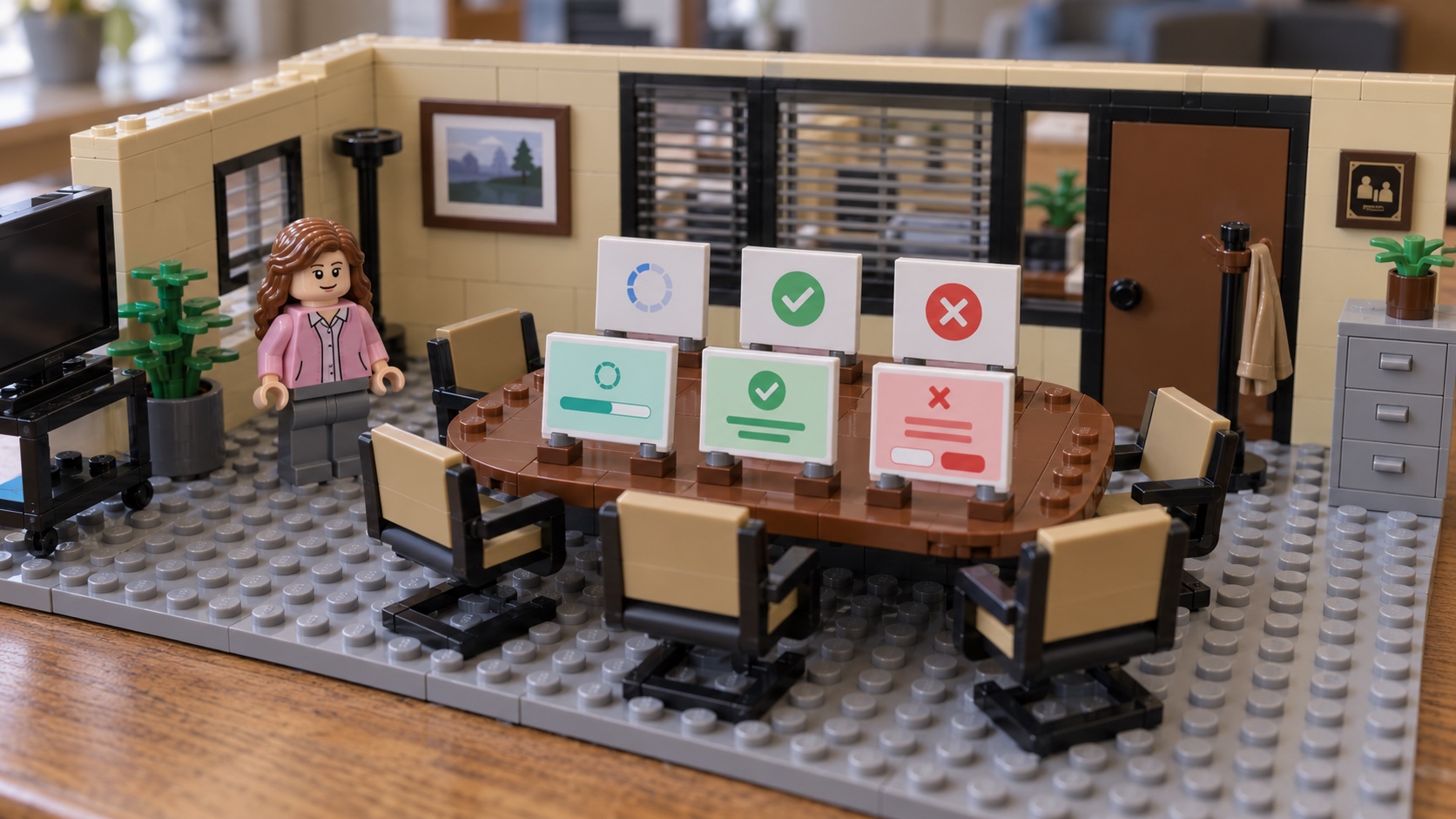
The manager keeps the same states while the provider changes the content used to display each one.
Decide how results leave the screen
The default behavior is easy to overlook: success and failure hide after two seconds and on a tap. A failure with Retry has the same default. That can remove the retry opportunity before the user reaches it.
Here is a manager configuration that keeps retry failures until the user uses a button or the app changes state:
import DMUnLoader
import UIKit

@MainActor
func makePersistentFailureManager() -> DMLoadingManagerMain {
    DMLoadingManagerMain(
        state: .none,
        settings: DMLoadingManagerDefaultSettings(
            hudDismissal: DMHUDDismissalRules(
                failureWithRetry: DMHUDDismissal(
                    autoHide: .never,
                    cardTapHides: false,
                    backdropTapHides: false
                )
            ),
            hudWindowLevel: .normal + 1,
            backdrop: .dim()
        )
    )
}
In DemoSceneRoot, initialize the state object with @StateObject private var manager = makePersistentFailureManager() to apply this policy to the same Save flow.
Close still hides the failure. The Save example’s Retry action calls saveChanges again, which explicitly shows loading before restarting the operation.
The manager also rejects stale auto-hide callbacks, so a previous state’s timer cannot hide the next state. That protection concerns the timer, not the app’s work: an older request can still overwrite a newer result unless the host handles cancellation or checks operation identity. The auto-hide tests exercise the timer boundary.
The actions and the backdrop are separate pieces
DMUnLoader depends on two of my other libraries, each doing a smaller job:
- DMAction supplies the callable actions behind Retry and Close. Its separate API also supports retry and fallback composition.
- DMVariableBlurView provides the backdrop whose blur radius varies across the view. DMUnLoader uses it for the default variable-blur backdrop. The manager can instead choose
.dim(),.material()or.clear.
See their linked repositories for examples and details of action composition and variable blur.
The default variable blur uses a private system filter. Choosing another backdrop avoids constructing that effect, but does not remove the dependency’s private API references from the linked code. See DMVariableBlurView’s documentation when assessing that choice.
Why I gave the HUD its own window
The reusable state API still needs somewhere to present its views. I ran into a concrete problem with that part: the HUD was visible over an iOS app, but the tab bar at the bottom still accepted taps. The operation was supposed to keep the user in the current flow, yet switching tabs remained possible.
That made me check two things separately: where the HUD draws and where it receives input. A screenshot of full coverage does not establish both.
A view can cover an area without owning its taps
An overlay belongs to the view it modifies. In UIKit, the selected controller supplies tab content while UITabBarController supplies the tab bar; blocking the former does not automatically block the latter. For SwiftUI, check whether the HUD wraps TabView or sits inside one tab. Its private backing hierarchy is not a contract.
UIKit can draw a child outside its parent’s bounds without routing taps there: hit testing does not enter a parent’s subtree for an outside point. Apple’s QA1812 describes this case. It is one possible explanation for visual coverage without input coverage, not a diagnosis of my original app without its hierarchy and a reproducer.
ignoresSafeArea changes layout, zIndex changes display order, and disabled affects interaction within its view hierarchy. allowsHitTesting(false) removes a view from hit testing; it does not turn that view into an input shield. Each still depends on where the HUD is attached.
An overlay at the right common ancestor can work. If all I need is to block a tab container, moving the barrier around that container may be enough. I also wanted a presentation boundary that could cover app presentations beyond one feature’s view hierarchy.
A scene window gives the HUD its own presentation boundary
Federico Zanetello’s Custom HUDs in SwiftUI separates HUD state from individual feature views. His follow-up, How to layer multiple windows in SwiftUI, demonstrates a root HUD being obscured by a sheet and moves it into another window. Those 2021 articles inspired this part of my implementation.
The presenter adds a UIWindow to the existing UIWindowScene. App content and HUD remain in the same scene.
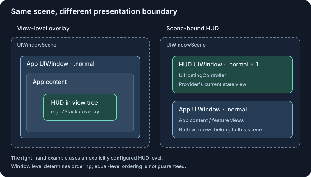
The presenter retains the window, gives it a UIHostingController, and makes the hosting view’s background clear. It shows the HUD with isHidden = false. Calling makeKeyAndVisible() would also request key-window status, a separate responsibility described in Apple’s documentation. Showing a loading layer does not require that request.
The window’s level is an explicit decision. For app windows at .normal, a HUD at .normal + 1 sits above them. Ordering between equal-level windows is not guaranteed. Neither setting means above every custom window, the keyboard or system UI. That limitation comes from windowLevel, not from the appearance of the card.
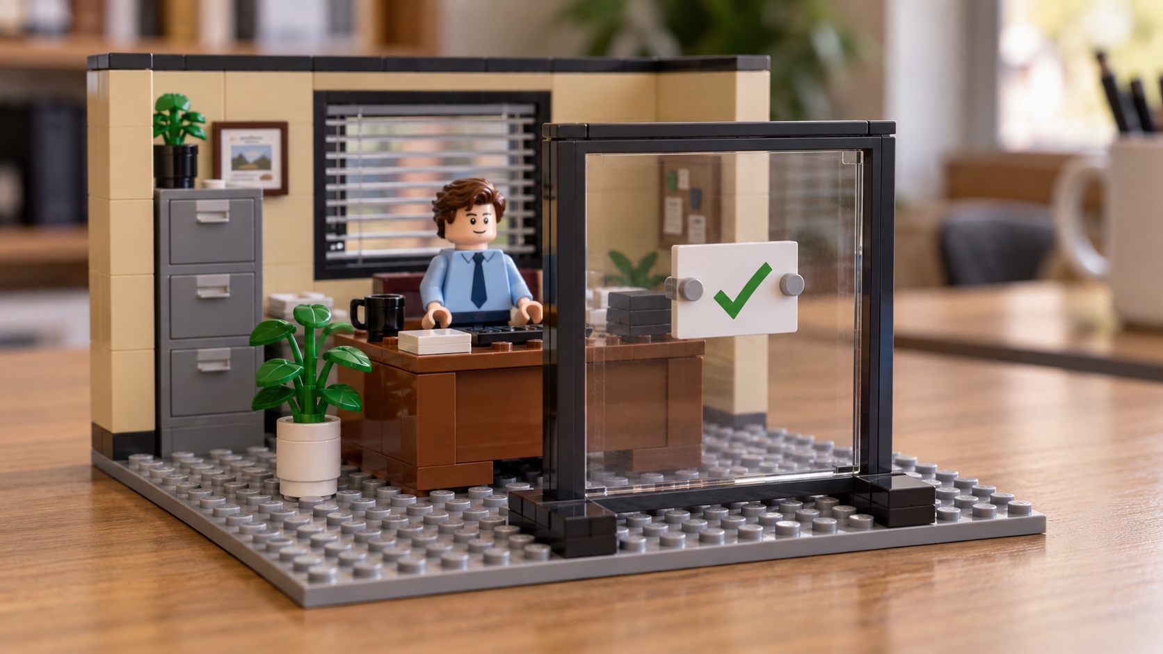
The empty-looking area must block input too
This HUD uses a modal input policy while a state is visible and passes touches through while idle. A reduced version of the SDK’s window policy connects that rule to presentation state:
import UIKit

@MainActor
final class ModalHUDWindow: UIWindow {
    var showsHUD = false

    override func hitTest(_ point: CGPoint, with event: UIEvent?) -> UIView? {
        guard showsHUD else { return nil }
        return super.hitTest(point, with: event)
    }
}
Set the flag before showing the window, then keep it synchronized with the presentation state. Idle returns nil; a visible HUD uses ordinary UIKit hit testing.
The hosted root also needs a surface covering the window, rather than only the centered card. Here is a reduced loading surface:
import SwiftUI

struct ModalLoadingSurface: View {
    var body: some View {
        ZStack {
            Color.clear
                .contentShape(Rectangle())
                .ignoresSafeArea()
                .onTapGesture { }

            ProgressView("Loading...")
                .padding(24)
                .background(.regularMaterial, in: RoundedRectangle(cornerRadius: 12))
        }
        .frame(maxWidth: .infinity, maxHeight: .infinity)
    }
}
The backdrop gesture consumes taps during loading. Results can connect it to dismissal instead. These reduced examples still need scene attachment, a hosting controller, retained ownership, and state wiring.
A clear backdrop can still block input. The state-controlled window and full-area hosted surface work together to enforce the modal policy.
Keep scene ownership and accessibility in the same implementation
The window presenter binds the window to the scene that actually hosts the requesting root. The injected integration discovers it through SceneHUDAnchor, rather than taking the first connected scene. Use one integration per scene; installing two can create two HUD windows.
hide() changes the manager to .none. The empty window can remain attached and pass touches through. Removing an injected root, clearing the scene delegate’s manager reference, or disconnecting the scene performs structural cleanup. Replacing a manager reuses the presenter’s window and hosting controller. Those are ownership rules as well as display rules.
Touch blocking also needs an accessibility counterpart. The accessibility adapter hides other non-HUD windows already attached to the scene at the HUD’s level or below from assistive technology and later restores their original state. Higher windows and windows added after the initial snapshot are outside that scope. Announcements, focus restoration, the escape gesture and reduced-effects handling are separate parts of the implementation.
The README’s known issues still matter when choosing the content: white content on the translucent default gray card can fall below 4.5:1 contrast, depending on the backdrop, and default loading text can clip at large accessibility sizes. Custom content needs its own contrast, text-size and VoiceOver checks. The 1.1.0 string catalog contains English defaults; the app supplies other text through settings.
Other approaches split the same responsibilities differently
For a small indicator tied to one screen, I would first consider a local view overlay. For freely designed messages with a queue, a message presenter has a different scope. Here the requirement is one modal loading/result state per scene, with state content that can be replaced. These choices determine which APIs are worth comparing. The following is a source-level comparison, not a performance benchmark or a ranking:
| Approach | State and presentation API | How the UI is customized |
|---|---|---|
| A SwiftUI view overlay | State and attachment chosen by the host view hierarchy | Arbitrary SwiftUI content; the host defines input and dismissal rules |
| DMUnLoader 1.1.0 | One manager with loading, success and failure; scene-bound window; SwiftUI and UIKit integrations | Settings for each default state; replace any or all three state views through a provider |
| AlertToast | SwiftUI .toast binding with loading, success (.complete), error and other built-in types; view overlay |
Built-in styling and presentation settings; its content closure returns AlertToast |
| ProgressHUD 15.0.3 | SwiftUI modifier and shared presentation/dismissal API with progress, results and other built-in types; view overlay | Built-in animation, icon, color and font configuration |
| SwiftMessages 10.0.2 | Message presentation in a view, controller or configured window scene; UIKit and SwiftUI support | Custom UIView or SwiftUI hosting content, plus presentation and dismissal configuration |
The relevant sources are AlertToast’s modifier, ProgressHUD’s SwiftUI implementation and public API and SwiftMessages. The comparison uses ProgressHUD 15.0.3, SwiftMessages 10.0.2, and AlertToast at commit 76a1c17. ProgressHUD’s UIKit 14.x line is a different implementation from its SwiftUI 15.x line.
SwiftMessages also supports an explicit .windowScene(scene, windowLevel:) context, so using another window is not exclusive to DMUnLoader. Its scope includes message queues and several presentation contexts. DMUnLoader’s API centers on one loading/result state, its three replaceable views, and the host’s Retry action. If that matches the app’s workflow, those are the boundaries to compare.
Check the whole loading-to-result flow
The repository has hosted window tests and interaction tests covering window ownership, modal versus idle input, clear backdrops and a later normal-level app window. Those examples do not contain a tab-bar or sheet reproducer; those presentations need checks in the host app. The example project provides a starting point for the integration.
For a host app, I would check the feedback flow with both the default provider and any replacement state views. Confirm the result text and layout, exercise Retry and Close, and verify the selected auto-hide and tap-dismissal behavior. A design change should not silently change those rules.
The presentation needs a separate interaction check. For an app with tabs:
- In the idle state, switch tabs and activate an underlying control.
- Show loading, tap those same areas, and verify selection and actions stay unchanged.
- Repeat with a sheet and a full-screen presentation already visible, using the app’s intended window levels.
- Move to success and error. Verify Close, Retry and the selected dismissal policy without also triggering a control underneath.
- Hide the HUD and verify interaction returns. Check the same sequence with VoiceOver and with independent scenes.
Conclusion
The part worth reusing is the path from starting an operation to showing its result and letting the user continue. Each feature still owns its work, but it should not need another implementation of loading, result presentation and dismissal every time its design changes.
That is the separation I built into DMUnLoader. A first integration can use the default views; a new design can change their settings or replace individual state content inside the shared HUD card. The app still reports loading, success or failure through the same manager API. SwiftUI and UIKit use that same model, while the scene-bound window gives the presenter a place to handle display and input independently of an individual screen’s layout.
For me, the useful test of this design is a later change: can I replace the loading indicator or error layout without rewriting the Save operation or building another presenter? That is what makes the presentation reusable across features and apps, while leaving each app in control of its work and appearance.
Additional Resources
Libraries and examples
- DMUnLoader repository
- DMUnLoader 1.1.0 usage guide
- DMAction
- DMVariableBlurView
- DMUnLoader example project
Implementation and tests
- DMLoadingViewProvider protocol
- Auto-hide tests
- DMPassThroughWindow input policy
- DMLoadingView presentation surface
- OverlayWindowPresenter
- SceneHUDAnchor
- Accessibility adapters
- DMUnLoader known issues
- HUDWindowTests
- HUDControlsUITests
Apple documentation
- SwiftUI overlay(alignment:content:)
- UITabBarController view hierarchy
- UIView.hitTest(_:with:)
- QA1812: delivering touch events outside a parent view
- SwiftUI ignoresSafeArea
- SwiftUI zIndex
- SwiftUI disabled
- SwiftUI allowsHitTesting
- UIWindowScene
- UIWindow.makeKeyAndVisible()
- UIWindow.windowLevel
Discussion
Comment translation
No languages found.